Gummerus
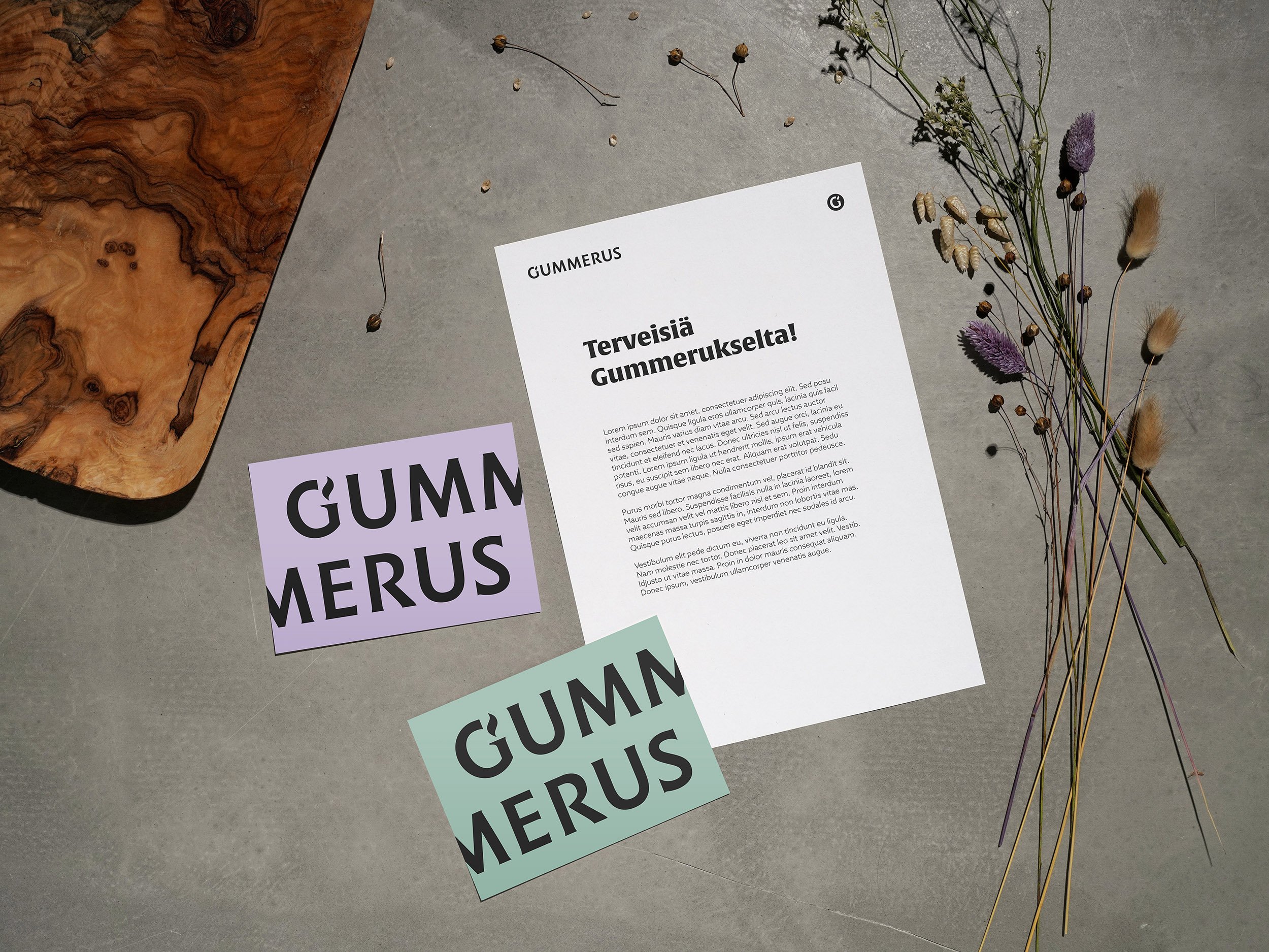
The aim of this visual update was to showcase the publisher's diversity through colours. The vibrancy of the visual identity is exceptional. It is based on limited tonal values: all muted light and dark shades are allowed. Gummerus' unchanged colors are black, white, and light gray. Alongside the colour scheme, the new visual identity included a logo and emblem, book mockups, guidelines for using the identity, and numerous layout examples.
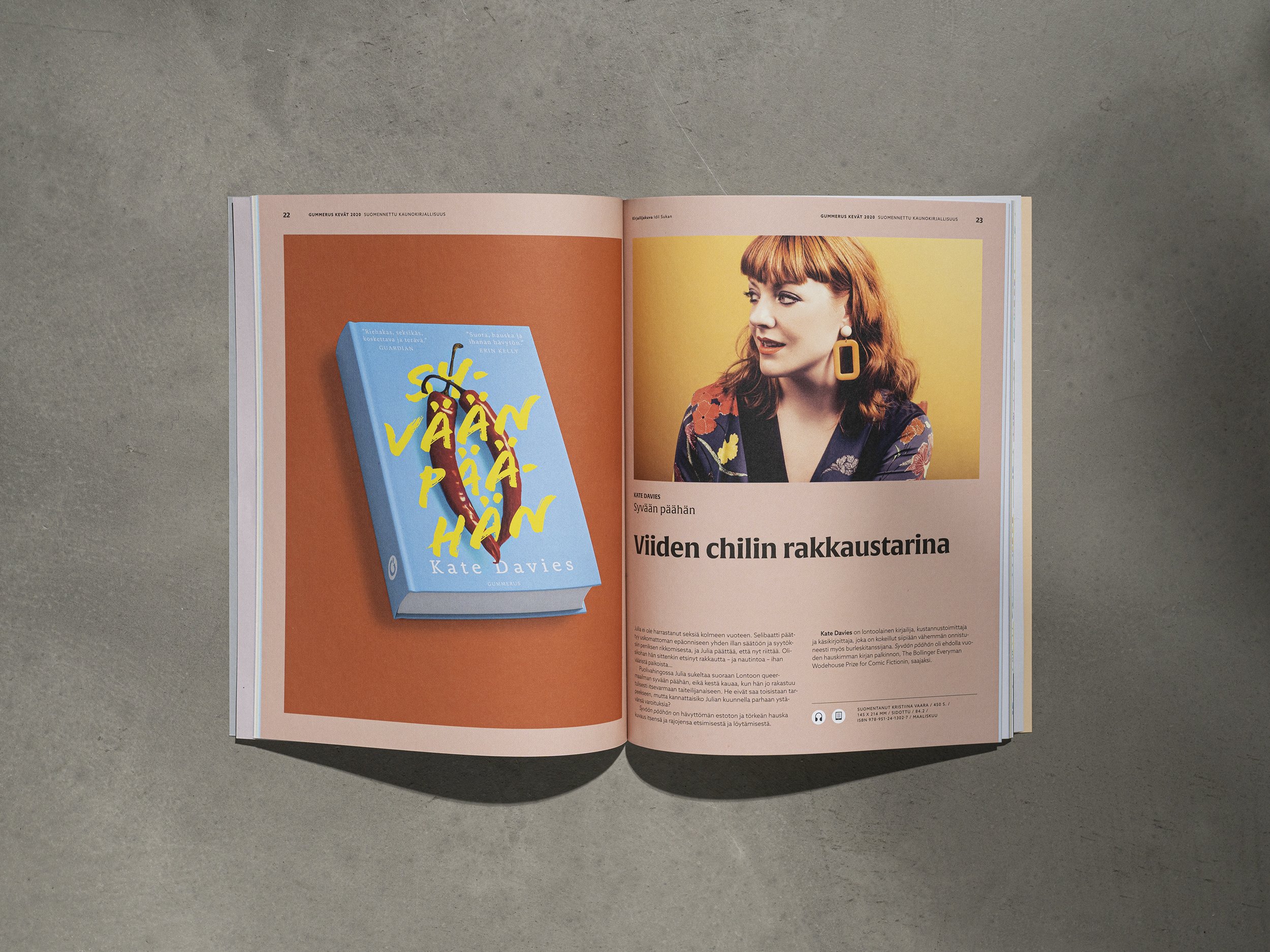
Shortly after the visual update, we created a new book catalog where the multicoloured design shines in full splendour. Each page of the catalog presents a different colour, with the backdrop of the three-dimensional book image reflecting the colours on the book covers. I laid out all the book catalogs between 2020 and 2023 after the update.
Agency: Sparksof
ART direction: Mia ollikainen, Anna tuomela
Graphic design: anna tuomela
Photos: Anna Tuomela


